Before there were commercials and whole branding exercises hailing the notch on the Apple iPhone there was a long row of iPhones Xs devices in the lobby of the Steve Jobs theater. The iPhone Xs was part of the second generation of notched iPhones so it was all kind of about the notch—but it was also about the fancy OLED display that showed off perfect blacks compared to the Xr's traditional LED. Which is why Apple put a vibrant wallpaper with bright pops of color on the Xs and the notch disappeared into the perfect black of the OLED display. There was something timid about the choice to hide it in the wallpaper. Like Apple wasn't quite as confident of its now fairly iconic screen cutout. With the iPhone 14 Pro it looks like Apple has finally figured it out.
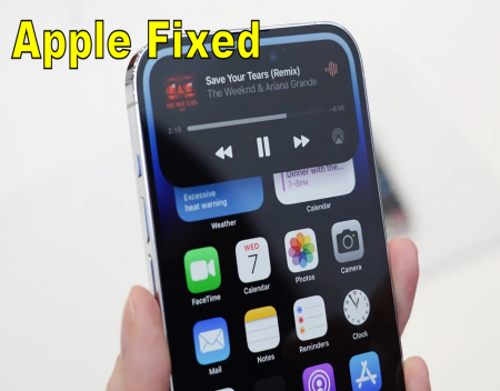
It's the "Dynamic Island", a black contextual box that will now appear around the iPhone 14's cutout, inviting you to toggle DND mode, monitor the length of your phonecalls, check how much life is left in your AirPod batteries, or even pop up a sports score. This last one doesn't really matter to me, but apparently, a lot of you love sports and Apple has decided to give you lots of very pretty ways to monitor your sports. The box pops up with a little animation. It's smooth and pleasant in the way the best user interface animations are. I looked at it and immediately had the urge to fidget with it, long pressing to open a widget, or just tapping on it to activate and deactivate the Dynamic Island.
Which, wow. The Dynamic Island, has just the goofiest name, but it feels like a vital new part of Apple's design language. It is kind of like notifications and the contextual phone call menu all wrapped up in one and fully, seemingly beautifully, integrated with the phone's pitch black cutout containing the camera. During the video showcasing the new design Apple said it could do away with the notch because it managed to shrink the TrueDepth camera array.
Five years ago there was no way to shrink the camera array, which included a camera, dot projector, microphone, speaker, ambient light sensor, proximity sensor, flood illuminator, and infrared camera. It had to be able to handle phone calls, and do Face ID, and take really good selfies. At the time Apple had two choices: keep a big bezel that would instantly make the phone look ugly and old-fashioned next to Samsung's offerings, or go for the notch. The notch would make the phone more expensive, as adding a notch to an OLED display increased the price. But the costliness of the move also made it feel just a little more luxurious. Kind of like cars opting for leather interiors when cloth does the job just as well and is cheaper.
Yet it always felt like Apple struggled to embrace the notch. It put it in there, and it told developers to be thoughtful about incorporating it in their own designs, but it seemed to struggle to take its own advice. All that space around the notch never seemed to do quite what you want. One of the biggest pain points was the battery percentage. Until iOS 16 there was no way to check the battery percentage on your phone at a glance. You either needed a widget, or you had to swipe down. With iOS 16, Apple finally brought the battery percentage indicator back, but the number was kind of ugly, and it meant losing a visual indication of battery level on the battery icon itself.
Pre-notch that status bar on the iPhone did some work. It didn't just tell you the time and the battery life of your phone in exceptional detail. It also told you what kind of network you were connected to and whether you had Bluetooth activated or a VPN connected. You would even see a little headphones indicator when music was playing. To make room for the notch Apple moved all of that and required you to handle your phone more. You now have to swipe and flip and tap to see things you used to be able to see with a glance.
The Dynamic Island likely won't solve that problem the notch originally presented, but it does seem to suggest that Apple realized we want that stuff and we don't want to have to zoom around the phone UI like a wizard to get it all. The Dynamic Island (I will never stop laughing at that name) feels almost like an exaggerated notch. Instead of dancing around the black bit at the top of the phone, Apple is expanding it, morphing it on a whim to help it address problems the notch used to create.
Source: Re-posted and Summarized from Alex Cranz at the verge.
We engaged The Computer Geeks in mid-2023 as they have a reputation for API integration within the T . . . [MORE].
We all have been VERY pleased with Adrian's vigilance in monitoring the website and his quick and su . . . [MORE].
FIVE STARS + It's true, this is the place to go for your web site needs. In my case, Justin fixed my . . . [MORE].
We reached out to Rich and his team at Computer Geek in July 2021. We were in desperate need of help . . . [MORE].
Just to say thank you for all the hard work. I can't express enough how great it's been to send proj . . . [MORE].
I would certainly like to recommend that anyone pursing maintenance for a website to contact The Com . . . [MORE].
The Apple Vision Pro mean

Google changed its privac
Hidden change to Windows